Hi
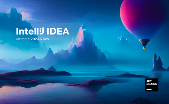
Just a bit of personal feedback on the new splash screen. As someone who has been using IntelliJ since 2012, this one feels a bit underwhelming. Honestly, it looks like the design budget was cut by 75%…
Hi
Just a bit of personal feedback on the new splash screen. As someone who has been using IntelliJ since 2012, this one feels a bit underwhelming. Honestly, it looks like the design budget was cut by 75%…
Agreed. The one for 2025.1 looked so much better.
it looks like the design budget was cut by 75%
Recent splash screen are no longer generated by hand. There was a blog post about that. It was ~2 years ago, something like that. I can’t remember.
In the past, they looked like this:
PS: I’m not saying it was better. As we say in France: “les goûts et les couleurs…“
Personally, I hate material icons, all those gray icons… and the new splash screens have no personality. I prefer colorful icons (they were colorful for good reasons) and beautiful graphics. Unfortunately, the majority (~80%, even if that number is questionable) prefers gray icons. It’s like the new designs are more focused on appearance (they look nice on the blog posts), less on efficiency.
We lost the battle.
This 2023.3 splash screen looks cool for me.
We are also not happy with the latest splash )
Hopefully, it will change soon, as we have a new version every 4 months